


The other day we were discussing the use of iconography with one of our clients as part of their organisation’s rebrand. After completing an audit of their marketing materials we pointed out that although they used a range of icons within their communications, they were seriously lacking in consistency.
As the company had grown they’d begged, borrowed and created custom designs for icons that didn’t fit together in any style, shape or form. It shocked them to realise that their icons were as much a part of their visual identity as their fonts, colour palette and illustration style.
We’ve found this a few times as we’ve worked through the branding or rebranding process. Clients don’t see iconography as an important asset even if they’re already using them. So, we thought it would be useful to put together a little ‘ode to the icon’, demonstrating how they can be built into a visual identity toolkit and can add character and individuality to a brand.
An icon intro
Icons are simple symbols that represent complex ideas or emotions. They have been used for communication for thousands of years. From ancient cave paintings to Egyptian hieroglyphics, pictures have influenced the alphabets we use today.
In the digital age, icons are crucial for navigating websites, apps, and interfaces. Offline, they are used in signs and environmental design to help people find their way or provide quick information.
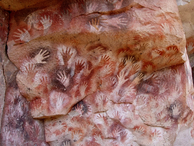
Hands at the Cuevas de las Manos upon Río Pinturas, near the town of Perito Moreno in Santa Cruz Province, Argentina. © Public domain, via Wikimedia Commons
When reviewing a brand, people often see iconography as something extra that can be added later and is not necessary needed in the initial designs. But if we think about the icon style together with other elements, icons can become the unsung heroes of brand recognition. They can effectively convey a brand’s essence, values, and brand narrative.
When considering the the selection of icons for a brand there are two distinct approaches: the creation of bespoke icons, tailored exclusively for your brand or the use of readily available stock iconography. Each approach brings its own set of advantages and disadvantages.
Stock and free iconography
When budgets are tight or where money is being used elsewhere – for example for commissioning illustration – stock icons can be an attractive option. They can be quickly accessed and incorporated into a visual identity. Stock libraries often group icons by industry, style or theme so a number of packs can be downloaded to form a set.
Websites such as The Noun Project have over five million icons designed in a range of styles that can be used either for free (under a Creative Commons licence) or purchased individually. Alternatively websites such as Google Material Symbols have a set of over 3,000 icons in a range of styles and weights that can be downloaded as a font or embedded directly into websites.
We used an open source set of icons (Atlas Icons) for our work with Rapid IT. We needed a range of icons to cover a large list of services and industries and, being a start-up with a limited budget, drawing these from scratch wasn’t an option. We made sure the icon style still fitted with the overall look and feel of the rest of the visual identity but saved money to spend on the real star of the show, the illustrations.
![]()
A selection of icons used for the Rapid IT visual identity
Stock icons are quick, cheap and readily available but they do have their downsides. The first is their lack of uniqueness. Stock icons (like stock photography) can be used by everyone and anyone diluting the individuality of your brand.
Sometimes you can’t find the right icon to illustrate your point. Icons are great for depicting nouns but if you’ve got a more complex idea to convey, stock icons can miss the mark. If iconography forms an important part of you brand’s visual identity it might be worth investing in something more bespoke.
Bespoke iconography
Creating custom iconography that mirrors a brand’s personality can help to give a more distinctive visual identity. It can be more time consuming and more expensive but it can add an additional uniqueness to a brand. Our work for Homesite estate agents for example, required an icon style that complemented their slab serif font but still fitted with the luxury feel of their brand and client’s expectations.
We developed a small suite of icons to be used in the property listings as a snapshot of a properties amenities as well as for use in their company brochure to highlight their local knowledge.
![]()
A comparison of the Homesite typeface and icon style
A close up of the Homesite company brochure
Creating bespoke icons allow more unique and precise communication of brand values, messages or abstract ideas. Ordnance Survey have an icon style baked into their visual identity system with clear guidance on how new icons should be created. As part of our work for the Learning and Development team we used this framework to create a range of icons to cover everything from ‘e-learning’ and ‘next steps’ to more abstract concepts such as ‘experimentation’ and ‘shared knowledge’.
![]()
The Ordnance Survey icon grid
![]()
Ordnance Survey Learning & Development icon set
Icons as illustration
Icons can also be elevated to the hero visuals within a visual identity, being used as an illustration style rather than a navigational or way finding device. We can be a bit more playful with this use of iconography and in our work for copywriters Yarn, we continue to add to Sophie’s library of icons using letters, symbols and punctuation to build glyphs symbolising everything from hats to dogs, shopping trolleys to cornflakes.
![]()
Yarn icons created from letters and punctuation
For Literacy100, we developed an icon style directly from the design for the book-inspired logo. We built icons from the recognisable shapes of spines and covers to reinforce messages and illustrate the stories of service users.
![]()
Literacy100 icons used to tell stories
Icon inclusion
Considering iconography as part of a visual identity is important but the choice between bespoke icons and stock iconography depends upon your brand’s budget, timeline, and the level of uniqueness you want to achieve.
Bespoke icons offer a personalised touch but come at a higher cost, whereas stock icons provide affordability and convenience but may lack distinctiveness. Ultimately a well-devised branding strategy should steer your decision, ensuring that your chosen icons effectively convey your brand’s essence to the world.